Robinhood
7 min read
Why Robinhood's $7.08 Welcome Bonus Works


Viral referral incentives are the holy grail for product teams.
Few nail it. This is partly because it requires an element of luck, but also it demands an ongoing experimentation of product psychology, subtle nudges and triggers.
Giving out 40% discounts in a "flash sale" might temporarily encourage people to sign-up, but they rarely go viral.
It's only through the lens of product psychology, that it makes sense why Robinhood offer new users $7.08 of free stock, and not $10.00.
There's a lot of nuance, and at times it's imperfect. But understanding why theirs works, will help you refine your own.
Case study
What Robinhood gets wrong:
Robinhood have a well-designed conceptual loop, but the "real" product (at least in the UK) is hurt by a series of avoidable UX issues.
1. Latency ≈ broken
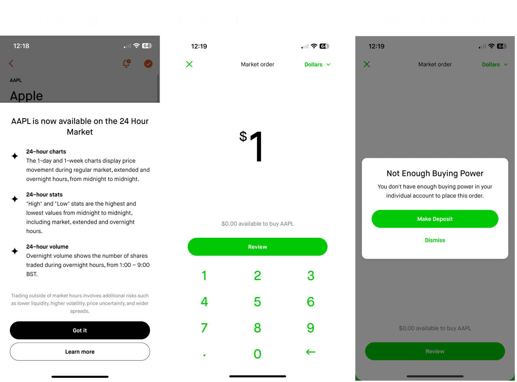
After creating your account, depositing money and verifying your ID, you'll land on a to-do list.
This prompts you to deposit money in order to claim your free stock—there's no reassurance that your previous deposit was successful.

If you make another deposit, that item in the to-do list will disappear entirely.
This also removes any mention of the free stock, and you still won't have any "buying power".

The technical problem is that you need both an approved account, and for your deposit to process—both of which take time.
You were literally promised to be "trading within seconds".
But then in the absence of sufficient context, anxiety and regret flourish.
The bottom line is this: you cannot expect your users to understand or be sympathetic to technical (or logistical) delays.
For example, if you're shipping a parcel, and there's a 24-hour window between when the user receives their tracking code, and when the tracking code actually starts working, then don't bother sending it.
2. Premature release
Let's tackle this theme of latency from another angle: how it affects onboarding prompts.
Ordinarily, you might 🌡️ Progressive Disclosure complexities when a user is curious about that thing.
But it's important to consider whether or not the user can actually engage with what you're teaching them.
As an example, new Robinhood users with pending deposits, will still be shown context about the 24 Hour Market, despite it being entirely unavailable to them at that time.
It's essentially this:
Hey, welcome to Robinhood
Check out this awesome feature
(User tries it)
WOAH, YOU CAN'T USE THIS YET!
Robinhood won't show this a second time. They're hoping that the user hasn't forgotten (or lost interest in) that feature by the time they can actually use it.
Like most UX, this is obvious in retrospect.
Your onboarding triggers will usually be more effective if they're shown as an introduction to the feature itself.
3. The Fresh Start problem
There's a bias called the 📆 Fresh Start Effect, which describes why people can be motivated by new beginnings.
It's useful when you want your users to purge their old failures, and "start fresh".
This manifests in most investing apps, because not only do you usually lose your old data, but you have to put up with a period of statistical irrelevance.
Gazing eyes on your portfolio for the first time, and seeing that you're 50% up on the day, accompanied by line charts that go vertically straight up is not a healthy welcome.
It doesn't make me want to transfer in my portfolio from elsewhere.

The issue is that this isn't an empty state, because there is some data—it's just that the data doesn't reflect what I intuitively understand to be happening.
There's a disconnect from what I'm seeing, and what I believe I should be seeing.
The most obvious painkiller here is context.
And I refer to it as one because it doesn't resolve the core issue—the data is still underwhelming.
But, context would provide relief for most of the confusion and anxiety.